library(tidyverse)
library(gtsummary)
library(dfmtbx)Generalized Linear Mixed Models: Binary Outcomes (work in progress)
Dataset description
The following tutorial is based on chapter 9 from Donald Hedeker and Robert Gibbons’ textbook “Longitudinal Analysis” and focuses on specifying mixed effect regression models in R and their interpretation.
The example dataset comes from the National Institutes of Mental Health Schizophrenia Collaborative Study. In this study, patients with schizophrenia were randomized into one of two groups, placebo drug group. The drug group received 1 of 3 anti-psychotic medications including chlorpromazine, fluphenazine, or thioridizine. All patients receiving an anti-psychotic medication were combined into one group for the following analyses. Most patients were measured at weeks 0, 1, 3, and 6, but some were measured at weeks 2, 4, and 5.
Hedeker & Gibbons focus on Item 79 (“Severity of Illness”) of the Inpatient Multidimensional Psychiatric Scale (IMPS) as the outcome variable. Item 79 was originally captured as a 7-point scale with responses ranging from “normal, not at all ill” to “among the most extremely ill.” In order to illustrate the implementation of mixed effect regression models for binary outcomes, Item 79 was dichotomized.
The primary research question is to determine if there is a difference between the two treatment groups in how Imps79 scores change over time.
Exploratory data analysis
str(data)tibble [3,059 × 10] (S3: tbl_df/tbl/data.frame)
$ id : Factor w/ 437 levels "1103","1104",..: 1 1 1 1 1 1 1 2 2 2 ...
$ imps79 : num [1:3059] 5.5 3 NA 2.5 NA NA 4 6 3 NA ...
$ imps79b : num [1:3059] 1 0 NA 0 NA NA 1 1 0 NA ...
$ imps79o : num [1:3059] 4 2 NA 2 NA NA 2 4 2 NA ...
$ int : num [1:3059] 1 1 1 1 1 1 1 1 1 1 ...
$ tx : num [1:3059] 1 1 1 1 1 1 1 1 1 1 ...
$ week : num [1:3059] 0 1 2 3 4 5 6 0 1 2 ...
$ sweek : num [1:3059] 0 1 1.41 1.73 2 ...
$ txswk : num [1:3059] 0 1 1.41 1.73 2 ...
$ imps79_bin: num [1:3059] 1 0 NA 0 NA NA 1 1 0 NA ...# Table 9.1
# Number of non-missing values by week and treatment group
data %>%
drop_na(tx) %>%
mutate(tx = ifelse(tx == 0, "Placebo", "Drug")) %>%
group_by(tx) %>%
summarize(
N = sum(week == 0),
Week0 = sum(!is.na(imps79) & week == 0),
Week1 = sum(!is.na(imps79) & week == 1),
Week2 = sum(!is.na(imps79) & week == 2),
Week3 = sum(!is.na(imps79) & week == 3),
Week4 = sum(!is.na(imps79) & week == 4),
Week5 = sum(!is.na(imps79) & week == 5),
Week6 = sum(!is.na(imps79) & week == 6)
) %>%
format_gt_tbl()| tx | N | Week0 | Week1 | Week2 | Week3 | Week4 | Week5 | Week6 |
|---|---|---|---|---|---|---|---|---|
| Drug | 329 | 327 | 321 | 9 | 287 | 9 | 7 | 265 |
| Placebo | 108 | 107 | 105 | 5 | 87 | 2 | 2 | 70 |
Generate summary statistics
Observed proportions
# Tabulate the proportion of participants with an imps79 score of 3.5 or more
tab_9.2.1 <- data %>%
  drop_na(tx) %>%
  filter(week %in% c(0, 1, 3, 6)) %>%
  mutate(week = str_c("Week", week)) %>%
  group_by(tx, week) %>%
  summarise(
    prop = mean(imps79_bin, na.rm = TRUE), .groups = "drop"
  ) %>%
  pivot_wider(
    names_from = week,
    values_from = prop) %>%
  mutate(tx = ifelse(tx == 0, "Placebo", "Drug")) %>%
  ungroup()

tab_9.2.1 %>%
format_gt_tbl()| tx | Week0 | Week1 | Week3 | Week6 |
|---|---|---|---|---|
| Placebo | 0.981 | 0.905 | 0.885 | 0.714 |
| Drug | 0.988 | 0.822 | 0.659 | 0.423 |
Although, the time points included weeks 0 through 6, only weeks 0, 1, 3, and 6 are displayed since weeks 2, 4, and 5 had a relatively much smaller number of non-missing values. However, all time points will be entered into the model in a subsequent step.
Inspecting the observed proportions reveals that the proportions of patients reporting a moderately ill or greater severity level are very similar in both placebo and drug groups (98.1% and 98.8% respectively). In addition, both groups appear to improve over time in the severity of illness as evidence by decreasing proportions moderately ill or greater. Lastly, it appears as though the magnitude of change is greater in the drug group compared to the placebo group.
Observed odds
# Calculate the odds for each group in weeks 0, 1, 3, and 6
tab_9.2.2 <- data %>%
  drop_na(tx) %>%
  filter(week %in% c(0, 1, 3, 6)) %>%
  group_by(tx, week) %>%
  summarise(
    ill = sum(imps79_bin, na.rm = TRUE),
    not_ill = sum(imps79_bin == 0, na.rm = TRUE),
    .groups = "drop"
  ) %>%
  mutate(odds = ill / not_ill) %>%
  select(tx, week, odds) %>%
  mutate(week = str_c("Week", week)) %>%
  pivot_wider(names_from = week, values_from = odds) %>%
  mutate(tx = ifelse(tx == 0, "Placebo", "Drug"))

tab_9.2.2 %>%
format_gt_tbl()| tx | Week0 | Week1 | Week3 | Week6 |
|---|---|---|---|---|
| Placebo | 52.50 | 9.50 | 7.70 | 2.50 |
| Drug | 80.75 | 4.63 | 1.93 | 0.73 |
The odds can be thought of as the probability of something happening divided by the probability of that same thing not happening. The odds for the placebo group at week 0 are 52.5. This can be interpreted as for each patient that is less than moderately ill, we can expected 52.5 patients are moderately ill or greater. A key to understanding odds is to remember that they represent a ratio and not a probability.
Observed log odds (logits)
# Calculate the log odds (logits)
tab_9.2.3 <- tab_9.2.2 %>%
  mutate(across(-tx, ~ log(.x)))

tab_9.2.3 %>%
format_gt_tbl()| tx | Week0 | Week1 | Week3 | Week6 |
|---|---|---|---|---|
| Placebo | 3.96 | 2.25 | 2.04 | 0.92 |
| Drug | 4.39 | 1.53 | 0.66 | −0.31 |
We can obtain the log odds (logits) by applying the log() function to each value in table 9.2.2. For example, the log of 52.5 is equal to 3.96 for the placebo group in week 0. Calculating the logits in this manner can be useful for plotting data in a subsequent step. In addition, it can help calculated the differences in the log odds.
A brief aside on the observed log odds
Suppose we only had the data from the baseline timepoint and we wanted to test if there was a difference in the proportions of moderately ill or greater patients in the two treatment groups. We could fit the following model and display the output. Notice that the intercept, which represents the log odds of moderately ill or greater in the placebo group, is equal to 3.96 which the same value for the placebo group in shown table 9.2.3. In addition, the coefficient for treatment group (tx), is .43. This means that the log odds of the drug group are .43 higher than the pacebo group. An alternative, yet equally valid, interpration is that the log odds of moderately ill or greater in the placebo group are .43 lower than the drug group as will be shown below in table 9.2.4. The values in Table 9.2.3 are the results for the intercept and coefficient for treatment if separate cross sectional models for each week were to be fitted.
broom::tidy(
  glm(imps79_bin ~ tx, family = "binomial", data = (data %>% filter(week == 0)))
) %>%
format_gt_tbl()| term | estimate | std.error | statistic | p.value |
|---|---|---|---|---|
| (Intercept) | 3.96 | 0.714 | 5.55 | < 0.001 |
| tx | 0.43 | 0.873 | 0.49 | 0.622 |
Differences in logits and the exponentiated differences
The differences in the log odds of moderately ill or greater can also be calculated and displayed along with the exponentiated difference. As shown above, the log odds for the placebo group would be equivalent to the intercepts if we had fit individual models with cross sectional data from each time point. The differences would be equivalent to the coefficients for the main effect of treatment (tx). Lastly, the exponentiated differences, represent the odds ratios. In the case of week 0, the odds of moderately ill or greater in the placebo group are 45% [(1 - .65) * 100] lower when compared to the drug group. However, as the study progresses we observe that the odds of moderately ill or greater are higher in the placebo group at each subsequent timepoint suggesting that drug group may be improving at a differential rate. We turn to visualizing these patterns in the next section.
# Differences in the log(odds) for each group in each week
tab_9.2.4 <- tab_9.2.3 %>%
  arrange(tx) %>%
  select(-tx) %>%
  summarise_all( ~ diff(.x))

# Exponentiated differences in log odds
tab_9.2.5 <- tab_9.2.4 %>%
  mutate(across(everything(), ~ exp(.x)))

# Bind rows and display
bind_rows(
  tab_9.2.4,
  tab_9.2.5) %>%
  mutate(value = c("diff", "exp(diff)")) %>%
  select(value, everything()) %>%
format_gt_tbl()| value | Week0 | Week1 | Week3 | Week6 |
|---|---|---|---|---|
| diff | −0.43 | 0.72 | 1.38 | 1.23 |
| exp(diff) | 0.65 | 2.05 | 3.99 | 3.42 |
Visualize data
One approach to visualizing data for a logistic regression is to plot the logits, since these effectively serve as the dependendent variables in a regression model. In the first plot, we notice an “elbow” or knot at week 1 that shows a steeper rate of change between week 0 and week 1 relative to the change between week 1 and week 6. In the text, Hedeker & Gibbons mention that one approach to address this situation would be to fit a model with polynomial trends. However, they chose to model time expressed as the square root of week instead. Using the square root of week produces a much more linear relationship and is more parsimonious than adding multiple polynomial terms. The drawback lies in the interpretation of the time variable since it is now in squared root units.
# Figure 9.6
# Plot the logits (log(odds)) vs time in weeks
tab_9.2.3 %>%
  pivot_longer(cols = -tx, names_to = "week", values_to = "logit") %>%
  mutate(week = as.numeric(substr(week, 5, 5))) %>%
  ggplot(aes(x = week, y = logit, color = tx, group = tx)) +
  geom_line() +
  geom_point() +
  scale_x_continuous(breaks = c(0, seq(1:6))) +
  theme_minimal() +
  theme(legend.position = "bottom")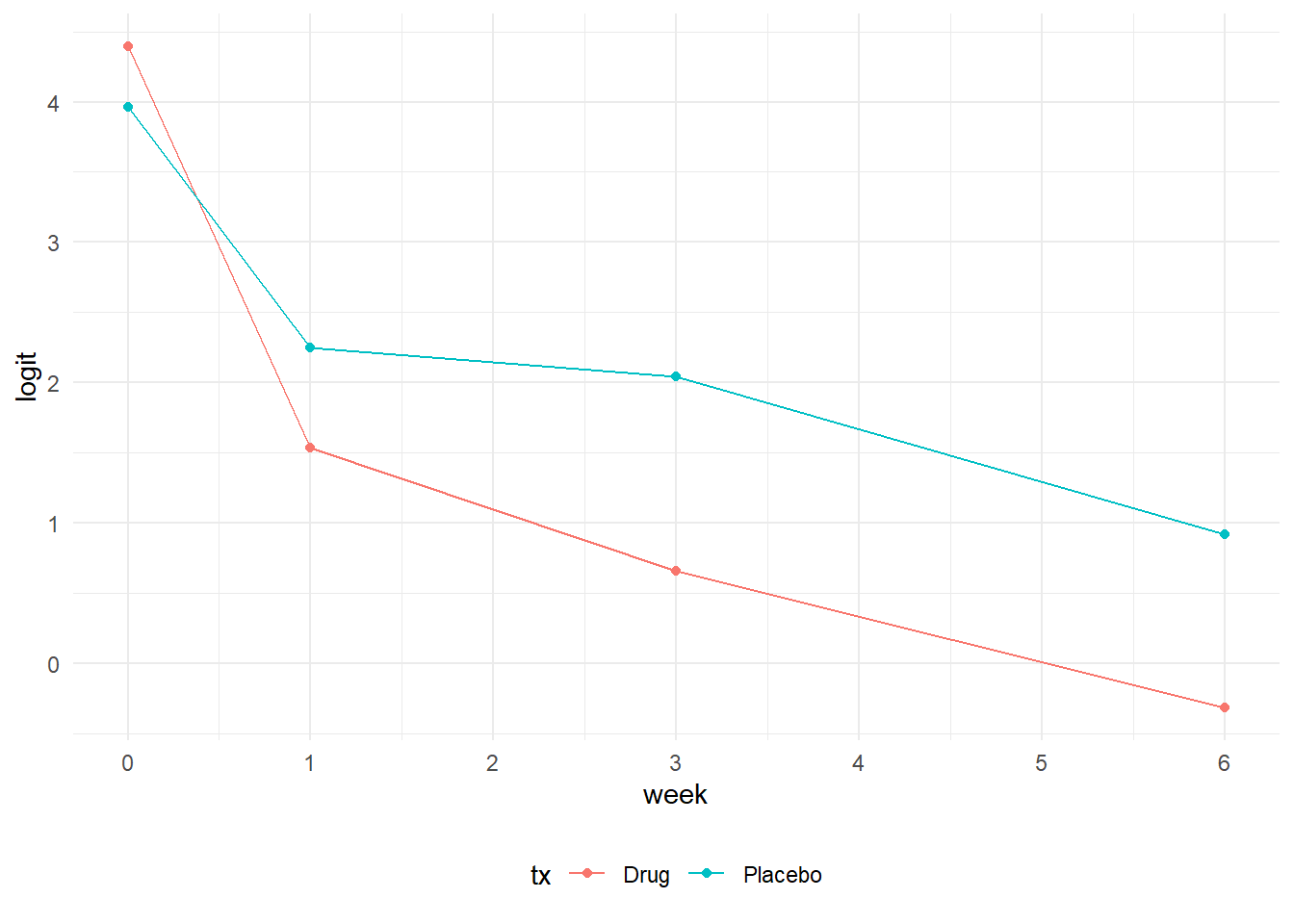
# Figure 9.7
# Plot the logits (log(odds)) vs time in square root of weeks
tab_9.2.3 %>%
  pivot_longer(cols = -tx, names_to = "week", values_to = "logit") %>%
  mutate(week = as.numeric(substr(week, 5, 5))) %>%
  mutate(week = sqrt(as.numeric(week))) %>%
  ggplot(aes(x = week, y = logit, color = tx, group = tx)) +
  geom_line() +
  geom_point() +
  scale_x_continuous(breaks = c(0, seq(1:6))) +
  labs(x = "Time (sqrt(week))") +
  theme_minimal() +
  theme(legend.position = "bottom")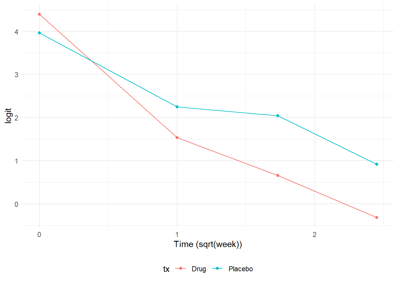
Random intercept model
We begin modeling by fitting a random intercept model. To fit a generalized linear mixed model with these data, we turn to the glmer() function from the lme4 package. The syntax is similar to the previously covered lmerTest() and lmer() functions in linear mixed models for continuous outcomes. One notable difference is that a family option is specified depending on the outcome. In this case our outcome is a binary variable, so set family to “binomial”. Other options include poisson and negative binomial for count outcomes. one other notable difference is the nAGQ option with sets the number of points per axis for evaluating adaptive Gauss-Hermite quadrature approximation to the log-likelihood. Values > 1 produce greater accuracy with the trade off a longer compuation time. Since the random intercept model presented in the text was likely fitted using SAS’s GLIMMIX procedure and the quadrature option, setting the nAGQ option to 15 in glmer() produces reasonably close results. In practice, one can determine the number of nAGC points by fitting the same model with different nAGQ values, saving the output, and then plotting the coeffiecients to determine at which nAGQ settings the coefficients stabilize. There is no drawback to setting a higher nAGQ value other than it takes additional computation time, but setting a lower nAGC value may result in less accurate estimates.
# Random Intercept logistic regression model
model_tab_9.4 <- lme4::glmer(
  imps79b ~ tx*sweek + (1 | id),
  family = "binomial",
  data = data,
  nAGQ = 15
)

broom.mixed::tidy(model_tab_9.4, conf.int = TRUE) %>%
  select(-(effect:group)) %>%
format_gt_tbl()| term | estimate | std.error | statistic | p.value | conf.low | conf.high |
|---|---|---|---|---|---|---|
| (Intercept) | 5.39 | 0.631 | 8.54 | < 0.001 | 4.15 | 6.62 |
| tx | −0.02 | 0.653 | −0.04 | 0.970 | −1.31 | 1.26 |
| sweek | −1.50 | 0.291 | −5.16 | < 0.001 | −2.07 | −0.93 |
| tx:sweek | −1.01 | 0.334 | −3.04 | 0.002 | −1.67 | −0.36 |
| sd__(Intercept) | 2.12 |
Interpretation
- The coefficient for the (Intercept) represents the predicted log odds of being moderately ill or greater in the placebo group at baseline when the time variable sweek is equal to 0.
- The treatment main effect is -0.02. This represents the difference in odds of being moderately ill or greater between the drug and placebo groups at baseline (sweek = 0). The coefficient, -0.02, is approximately equal to 0.98 when exponentiated. This suggests that the odds of moderately ill or greater are 2% lower the drug group compared to the placebo group while holding time constant. However this effect is not statistically significant.
- The time main effect is -1.5. This coefficient represents the change in odds of being moderately ill or greater for each 1-unit increase in time for the placebo group. The exponentiated coefficient is approximately equal to 0.22 and suggests that each 1-unit increase in time is associated with a 78% decrease in the odds of being moderately ill or greater. This effect is statisitically significant and suggest reductions in Imps79 scores over time.
- The interaction effect is -1.01. This coefficient represents how the time slope in the drug group differs from the placebo group. The exponentiated coefficient is approximately equal to 0.36 and suggests that the effect of time in the drug group is 64% lower than that of the placebo group and is a statisically significant effect. To obtain the time slope in the drug group as opposed to the difference in slope, we add the sweek and tx:sweek coefficients (b_sweek + b_tx:sweek = -1.05 + -1.01 = -2.51). The exponentiated value of -2.51 is approximately 0.08. This suggests that a 1-unit increase in time is associated with a 92% decrease in the odds of being moderately ill or greater in the drug group.
To summarize, this model tells us that there are no differences in illness between placebo and drug groups at baseline. The two groups have comparable levels of illness severity. In addition, the placebo group demonstrates a statistically significant rate of improvement in illness severity over time. Latly, the satistically significant interaction suggests the drug group improves at a greater rate over time. As observed in the plot of the logits above, both groups improve in illness severity, but the improvement in the drug group occurs at a steeper rate.
Random intercept and trend model
One limitation of the glmer() function is that setting the nAGC option to a value of greater than 1 is only available for models with one random effect. Adding a random trend to the model and using nAGC > 1 will produce an error. To overcome this limitation, we turn to the mixed_model() function of the GLMMadaptive package. The GLMMadaptive package uses a slightly different syntax. The random effects are specified as a separate argument rather than including them in the model formula with the fixed effects. In this respect, the structure more closely mimics how random effects are specified in SAS using separate MODEL and RANDOM statements.
model_tab_9.6 <- GLMMadaptive::mixed_model(
  imps79b ~ tx * sweek,
  ~ 1 + sweek | id,
  family = "binomial",
  data = data,
  nAGQ = 15
)
# Define column names
col_names <- c("term", "estimate", "std.error", "statistic", "p.value", "conf.low", "conf.high")
# Create a matrix with 2 rows
var_matrix <- matrix(NA, nrow = 2, ncol = length(col_names))
# Convert matrix to a data frame
var_mod <- data.frame(var_matrix)
# Assign column names
names(var_mod) <- col_names
# Set the variance of the random effects as sd()
var_mod <-
var_mod %>%
mutate(
term = c("sd__(Intercept)", "sd__sweek"),
estimate = c(
sqrt(model_tab_9.6$D[1, 1]),
sqrt(model_tab_9.6$D[2, 2])
))broom.mixed::tidy(model_tab_9.6) %>%
bind_rows(., var_mod) %>%
as_tibble() %>%
format_gt_tbl()| term | estimate | std.error | statistic | p.value | conf.low | conf.high |
|---|---|---|---|---|---|---|
| (Intercept) | 5.91 | 0.941 | 6.28 | < 0.001 | 4.07 | 7.76 |
| tx | 0.28 | 0.741 | 0.38 | 0.702 | −1.17 | 1.74 |
| sweek | −1.40 | 0.472 | −2.96 | 0.003 | −2.32 | −0.47 |
| tx:sweek | −1.61 | 0.479 | −3.35 | < 0.001 | −2.54 | −0.67 |
| sd__(Intercept) | 2.62 | |||||
| sd__sweek | 1.74 |
Interpretation
- The coefficient for the (Intercept) represents the predicted log odds of being moderately ill or greater in the placebo group at baseline when the time variable sweek is equal to 0.
- The treatment main effect is 0.28. This represents the difference in odds of being moderately ill or greater between the drug and placebo baseline (sweek = 0). The coefficient, 0.28, is approximately equal to 1.32 when exponentiated. This suggests that the odds of moderately ill or greater are 32% higher in the drug group compared to the placebo group while holding time constant. However this effect is not statistically significant.
- The time main effect is -1.4. This coefficient represents the change in odds of being moderately ill or greater for each 1-unit increase in time for the placebo group. The exponentiated coefficient is approximately equal to 0.25 and suggests that each 1-unit increase in time is associated with a 75% decrease in the odds of being moderately ill or greater. This effect is statisitically significant and suggests improvement in Imps79 scores over time.
- The interaction effect is -1.61. This coefficient represents how the time slope in the drug group differs from the placebo group. The exponentiated coefficient is approximately equal to 0.20 and suggests that the effect of time in the drug group is 80% lower than that of the placebo group. -1.40 + (-1.61) = -3.01. The exponentiated value of -3.01 is approximately 0.05. This suggests that each 1-unit increase in time is associated with a 95% decrease in the odds of being moderately ill or greater in the drug group.
Comparing the two models
We can compare the random intercept and the random intercept + random trend models to determine if adding the random trend improves the model fit. To do so, we need to first fit the random intercept model using the GLMMadaptive package. Then, we can call the anova() function passing the two models as arguments. The results indicate a statistically significant Likelihood Ratio Test (LRT) which indicates that the random trend improves the fit and suggests that subjects differ meaningfully in their trajectories. Based on these observations, we would strongly consider opting for the random intercept and trend model to report our results.
model_tab_9.4 <- GLMMadaptive::mixed_model(
  imps79b ~ tx*sweek,
  ~ 1 | id,
  family = "binomial",
  data = data,
  nAGQ = 15
)


anova(model_tab_9.4, model_tab_9.6)
                  AIC     BIC log.Lik   LRT df p.value
model_tab_9.4 1259.74 1280.14 -624.87
model_tab_9.6 1241.41 1269.97 -613.71 22.32  2 <0.0001
Plot predicted and observed probabilities
Plotting the observed and predicted probabilities is a 3 step process. In the first step we deal with preparing the predicted values. To begin, a data frame is created that contains the values to use in prediction. In this case we wish to calculated predicted probabilities at 0, 1, 3, and 6 weeks. Recall that time was entered as the square root of week, so this manipulation is conducted here using the raw week values. This data frame is then used in the predict() function where we utilize the random intercept and trend model, and the type = “marginal” as arguments. The type = “marginal” argument specifies an approach developed by Hedeker et. al (2018) to use subject specific information to estimate marginal (or population averaged) probabilities that are typical of GEE models. Lastly, some manipulation is performed to display the treatment groups as text rather than 0s or 1s.
# Create a data frame with the levels of tx and sweek to use in
# for calculating predicted probabilities.
pred_plot_df <- expand.grid(
    tx = c(0, 1),
    week = c(0, 1, 3, 6),
    id = NA) %>%
  mutate(sweek = sqrt(week)) %>%
  arrange(tx) %>%
  tibble()

# Use the fitted model to predict marginal probabilities at
# 0, 1, 3, and 6 weeks. type = "marginal" uses Monte Carlo integration
# over the random effects as demonstrated in Hedeker et al., 2018.
pred_plot_df <- pred_plot_df %>%
  mutate(
    predicted_probs = predict(
      model_tab_9.6,
      newdata = pred_plot_df,
      type = "marginal")
  )

# Modify pred_plot_df for plotting
# The model uses tx = 0 or 1, but Placebo or Drug are going to be used in
# plotting
pred_plot_df <- pred_plot_df %>%
  mutate(tx = ifelse(tx == 0, "Placebo", "Drug"))
In the second step, we turn to preparing the observed probabilities. These were previously calculated in table 9.2.1. However these need to be converted into long format and contain the same y-axis variable as the predicted probabilities data frame. One key difference here is that tx will be renamed to tx_pts to enable setting different legends to the predicted and observed values.
# Prepare the observed proportions, naming them as predicted_probs and
# converting to long format. tx is renamed to explicitly tell ggplot
# that the x values represent a separate data set and legend
obs_probs <- tab_9.2.1 %>%
  pivot_longer(cols = Week0:Week6, names_to = "Week", values_to = "predicted_probs") %>%
  mutate(Week = as.numeric(substr(Week, 5,5))) %>%
  mutate(sweek = sqrt(Week)) %>%
  select(tx, sweek, predicted_probs) %>%
  rename(tx_pts = tx)
In the third and last step, the predicted probabilities are piped into ggplot using the geom_line() layer and the observed probabilities are set inside a geom_point() layer. From there, some manipulation of the scales to set custom legend titles and color to contrast the two sets of probabilities helps readability.
# Predicted probabilities
pred_plot_df %>%
  ggplot(aes(x = sweek, y = predicted_probs)) +
  geom_line(aes(group = tx, color = tx)) +

  # Observed probabilities
  geom_point(
    data = obs_probs,
    aes(x = sweek, y = predicted_probs, fill = tx_pts),
    inherit.aes = FALSE,
    shape = 21,
    size = 2) +

  # Change the color of the lines for contrast
  scale_color_manual(
    name = "Predicted (Lines)",
    values = c("Placebo" = "#FF9993", "Drug" = "#440154FF")) +

  # Change the color of the points and rename legend
  scale_fill_manual(
    name = "Observed (Points)",
    values = c("Placebo" = "lightpink", "Drug" = "blue")) +

  ylab("Probability") +
  xlab("Time (sqrt(weeks))") +
  theme_minimal() +
  theme(legend.position = "bottom")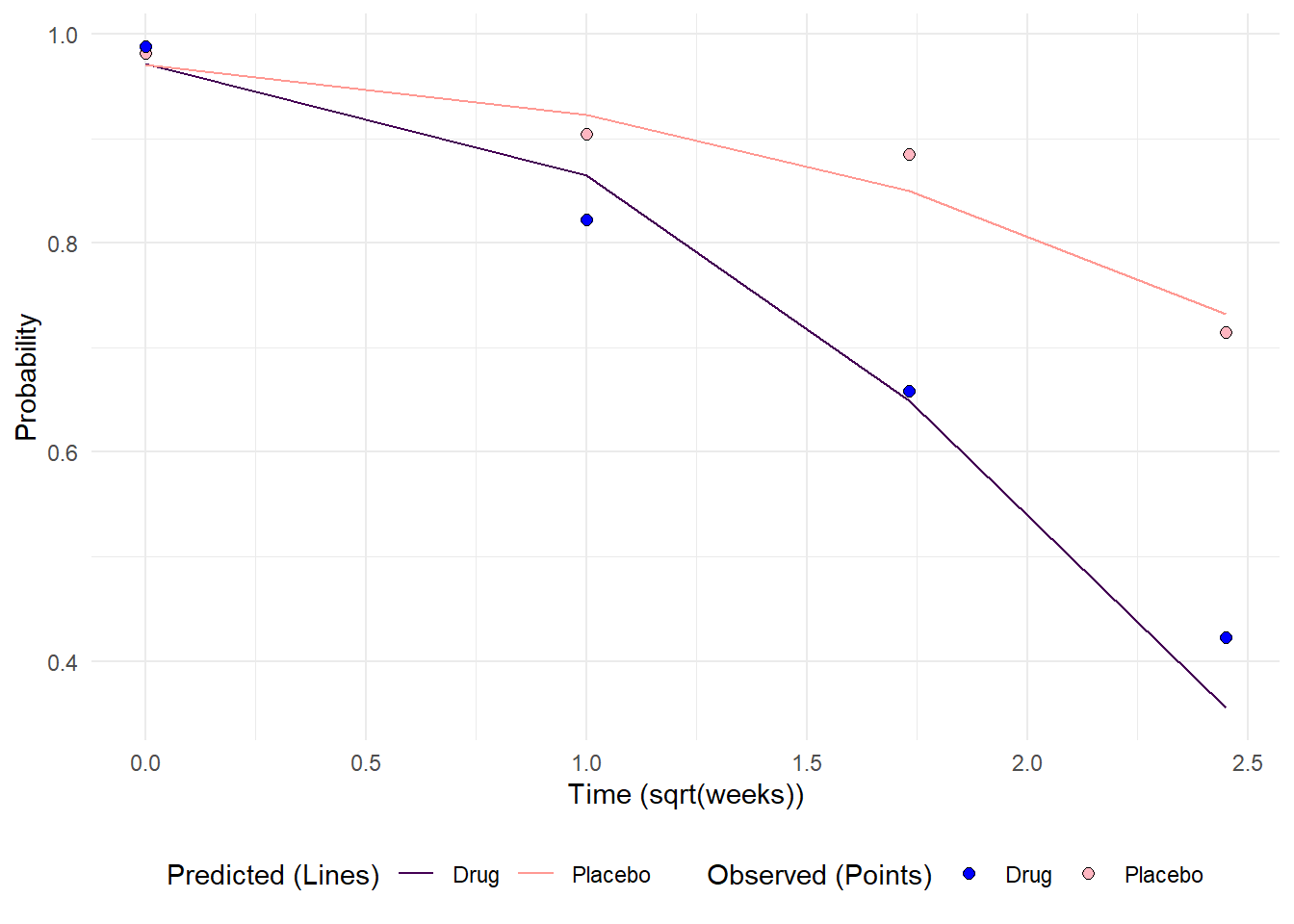
References
Hedeker, Donald; Gibbons, Robert D. (2006). Longitudinal Data Analysis. Wiley.
Hedeker, D., du Toit, S. H., Demirtas, H. and Gibbons, R. D. (2018), A note on marginalization of regression parameters from mixed models of binary outcomes. Biometrics 74, 354–361. doi:10.1111/biom.12707
Rizopoulos D (2025). GLMMadaptive: Generalized Linear Mixed Models using Adaptive Gaussian Quadrature. R package version 0.9-7, https://CRAN.R-project.org/package=GLMMadaptive.